Hey, wanderers!
First, we apologize for the lack of comms around the dye tweaks! We know how much time investment goes into unlocking them and the love put into getting things just so; that changes are very sensitive. In this case, there was a process breakdown where communications were drafted and never made it to the right hands for release.

What is happening now
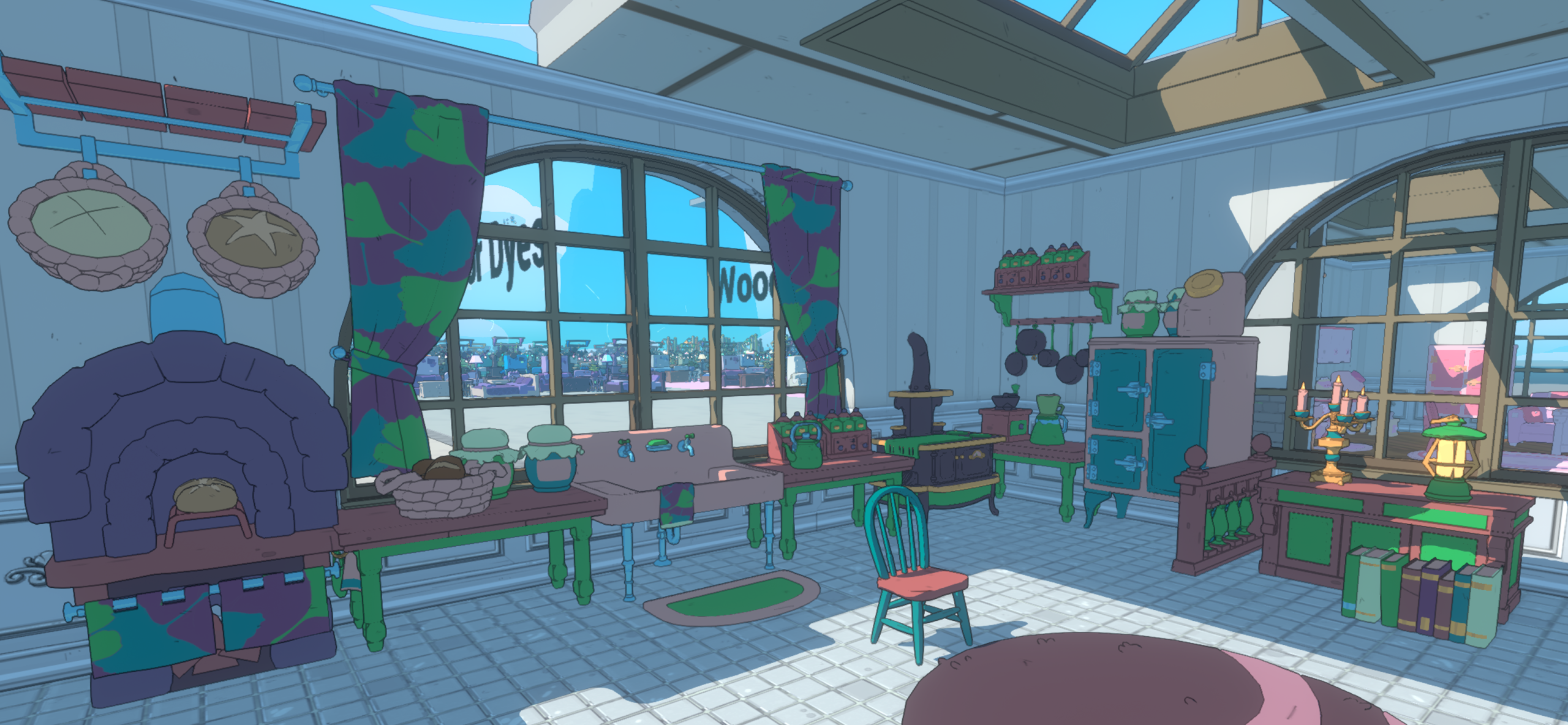
- We’re going to be reverting the fruit dyes to their former glory.
- While the fruit patterns were not something we had ever intended to ship with and made when our constraints around patterns were very different, the outpouring of support has pushed us to revert them for those who loved them. We’ll also try to improve the designs further in a future update (but not fundamentally change their character.) We are also going to re-introduce the newer geometric pattern variants for those who liked the new ones!
- We will also be adding the more geometric dyes from this last update as new items!
- People who bought either should now have both. Enjoy!

- People who bought either should now have both. Enjoy!
- For the other tweaks made to the decor dye colors:
- Internally, we cataloged dyes that felt garish when applied to many objects in a room together. Painted Dyes in particular (though not the only ones), which were designed to enable a full spectrum so you could paint your stone, wood, metal, and neutral items more colorfully, often looked like they either lacked contrast or were so intense as to be cartoony. In the future, if we make changes this drastic, we will likely “sunset” the dye – which means your items would remain, but we would no longer offer the dye in the shops, only selling the updated version of the dye.
- There are still future plans for decor dyes, but we aren’t quite ready to share what those are yet. But rest assured we are working to make sure future changes should not drastically later the appearance of anything you dye.

How the Dye System works
Second, let’s talk about how the dye/colorway system works – this is mostly to offer some transparency behind some of our decision making- we thought the insight would be fun, too.
- Every polygon (technically vertices) of every mesh is colored with one of 20 “slots”. You can see here how it looks to us in Unreal.
- This means that if for example, a wooden table is all Wood01, it will adopt the Wood01 color of a given dye- we can’t swap which slot it receives per dye.
- All dyes are applicable to all decor, which can present a few interesting wrinkles.

Some of the interesting challenges that fall out of this:
- We need to consider how slots appear between all decor items; whether a wooden bookshelf, a retro TV set, or a swampy log. So using “Wood02” just because something seems like it would be brown colored can sometimes work and sometimes not.
- As an example, with bookshelves we can get creative by using stone and foliage slots on the books for a fuller sense of hue variety. We often use “Stone” for matte, cast-iron like surfaces that should be less shiny, like the antique stove- and neutral can be anything from a teacup to a bathtub to a page of a book; things you commonly expect to be somewhat “off-white” or grey.
- (Similarly, we try to use “Emissive 01” for “raw, bright bulbs” and “Emissive 02” for lampshades and other obscured light sources when applicable)
- One of the main challenges with this system is when we run into a case where you want to dye a table red but the table is all wood. Our answer for this class of problem was to introduce “Painted Dyes”; dyes which might feel a bit garish on their own, but serve the purpose of letting you color neutral and natural tones something closer to the raw hue; they may find less common usage but they are designed to enable creativity.

On Our Goals with Dyes
Above all, we want you to be able to express yourself. As much as possible we want to enable to you create (or re-create) your own world within the limitations that run on your phone.
Secondary to that, we want to ensure you can easily create beautiful spaces.
Every dye is somewhat of a balance between these top two priorities. Why did we make the wood of the Natural Complex Lavender dye white instead of a richer brown? Aside from the fact that white and purple play together nicely, it helps us to offer a full spectrum of tones for natural woods.
Otherwise, we’d end up with a lot of very similar hues of wood that are not differentiated enough when you go to color wooden decor like the driftwood set, swamp set, etc; as much as we’d love to split out “wood” or ” stone” slots as entirely separate things, there are many constraints that prevent us from implementing a system like that.
Similarly, we have tried to offer a compromise with painted dyes where even the Wood or Neutral slots are toned down so that if you paint an entire room in that dye, there is some contrast so it is a little less visually flat, with the drawback being your wood/stone things with painted dyes will always be a little bit on the duller end most of the time.
Hopefully that gives some you some good insight into the kind of things we work to balance when crafting decor dyes!
See you in the Crosslands!
-SpryAcorn